The collapse of patience
Somewhere between the group chat and the algorithm, your audience's patience collapsed to roughly three seconds. That's the window your homepage, your ad, your reel gets before the thumb keeps moving.
That's an adaptation, not a failure of attention. People have learned to scan quickly because they're hit with thousands of messages a day. Your job is to be worth stopping for.
Designing for feeling, not reading
Three seconds sounds brutal, but it's clarifying. It forces the only question that matters: what's the one thing someone must feel immediately? Feel, not read. Confidence, desire, curiosity, relief. Pick one and aim everything at it.
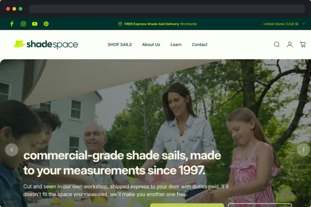
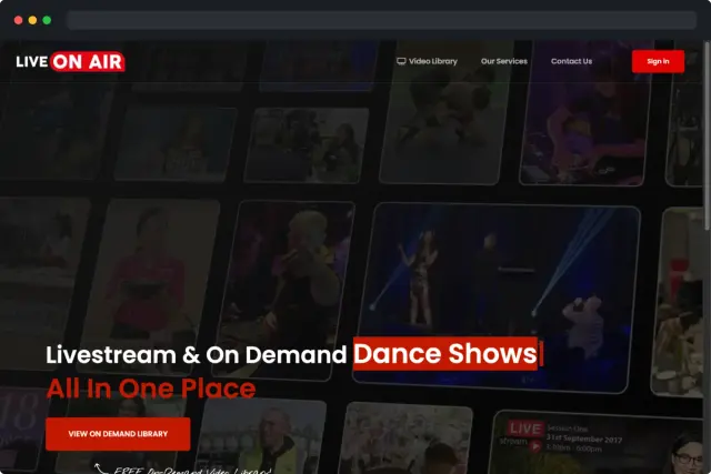
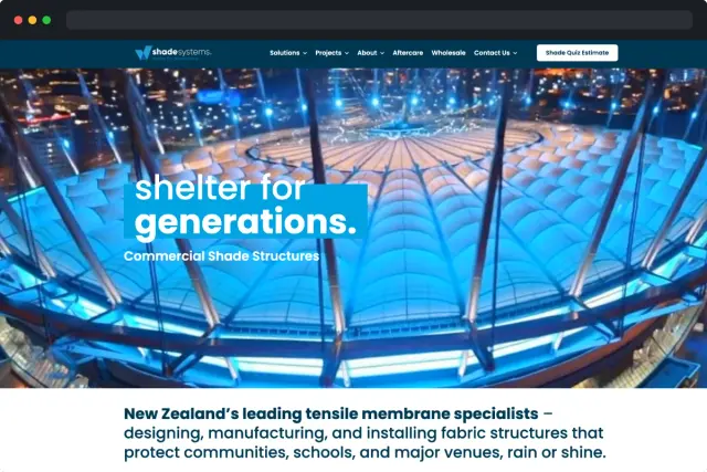
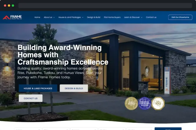
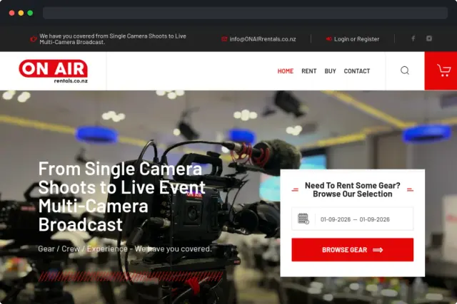
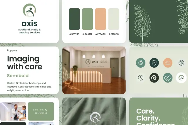
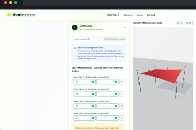
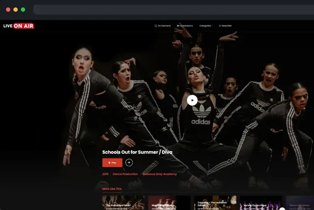
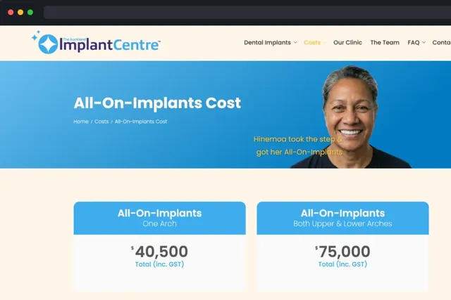
The brands that win here know emotion travels faster than information. A striking visual paired with a clear offer hits harder than a paragraph of features.
Practical rules for the three-second window
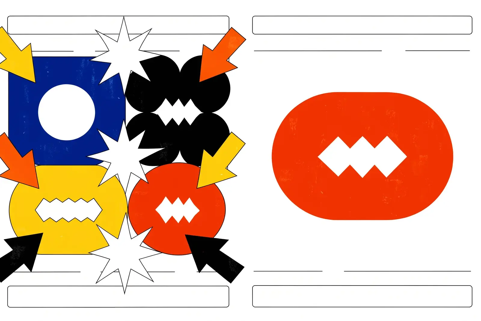
In practice that means one bold statement instead of four competing ones. Motion that draws the eye to the message, not away from it. A visual so distinct it couldn't belong to a competitor. And ruthless deletion of everything that merely 'also might be good to mention'.
Test it yourself: open your site on your phone, show it to someone for three seconds, then take it away. Ask them what it's about and how it made them feel. If they can't answer both clearly, you have work to do.
From the glance to the meeting
The brands that win the glance get the minute. The brands that win the minute get the meeting. It all starts three seconds in, so design for it.
Every element on your page should earn its place. If it doesn't serve the three-second test, move it below the fold or remove it entirely. Keeping it simple is a strategy, not a shortcut.