The toggle
spring · 320msNotifications on
Overshoots by four percent and settles, so it feels like a real switch.
Workouts that fit the day you’re actually having.
Upper body · personal best on bench
Mobile app design · iOS and Android
An app people understand the first time they pick it up. You tap through a working prototype before anyone writes code.
Every flow prototyped first · tap through it before anyone builds
Native to both platforms · iOS and Android conventions, one design
Handed over build-ready · components, specs and every state
Businesses we work with






This is what you get in week two: an app you can hold. Switch tabs, like a workout, open a session and drag it away, tap the chart, fill the ring, flip it to light mode.
Live prototype · built in code, not a video
People only notice a toggle when it feels wrong. Here are six small moments we spec, tune on a real phone and hand over with the numbers.
Overshoots by four percent and settles, so it feels like a real switch.
It scales, bursts and counts in 400 milliseconds. People tap it twice to see it again.
The button becomes the confirmation and the badge counts up. No pop-up needed.
The pill slides and the labels stay put, so your eye follows the pill.
Pull, feel it resist, let go past the line. A new row slides in from the top.
Drag to reveal. Past halfway it deletes. Let go early and it snaps back.
Sample designs for fitness, banking, food, travel, retail and transit. Same rules each time: the number first, one action in reach, nothing to tap by accident.
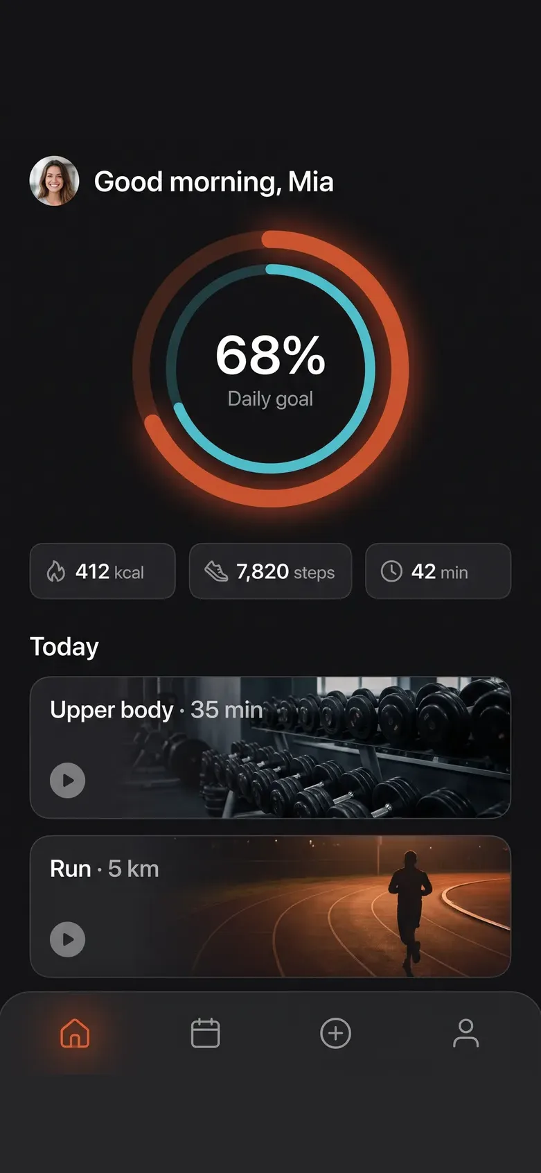
Fitness · iOS · Android
Activity rings, workouts, one-thumb navigation
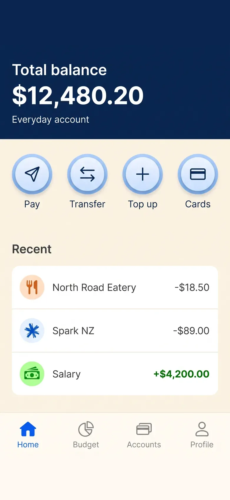
Banking · iOS · Android
Balance first, four actions, nothing else above the fold
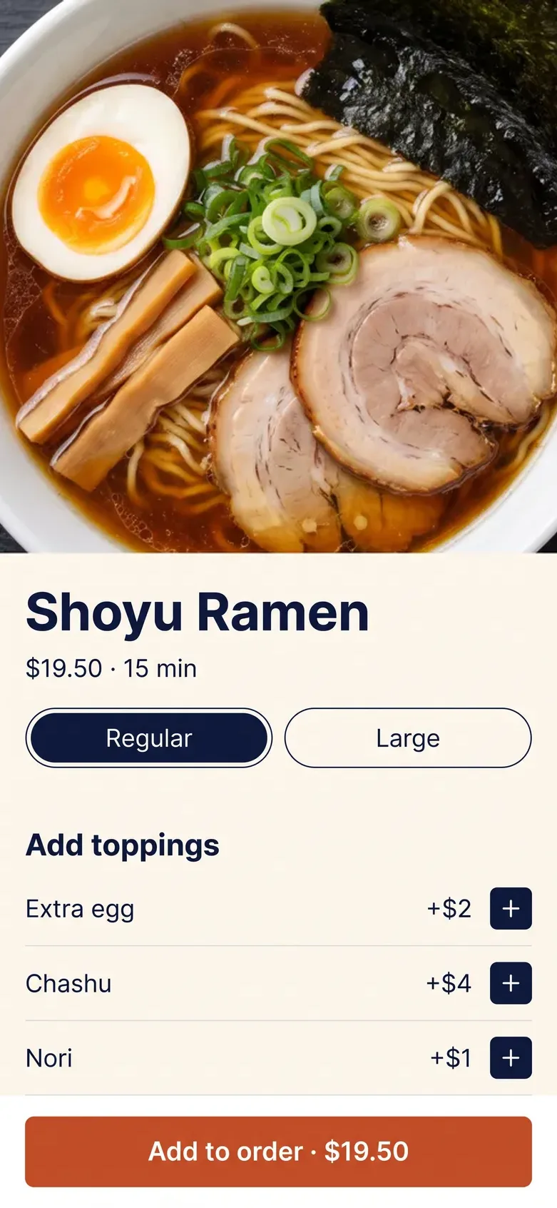
Food ordering · iOS
Photo, price, size, toppings, one sticky button
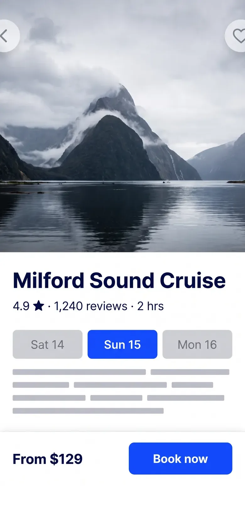
Travel · iOS · Android
Date chips in the thumb zone, price pinned to the bar
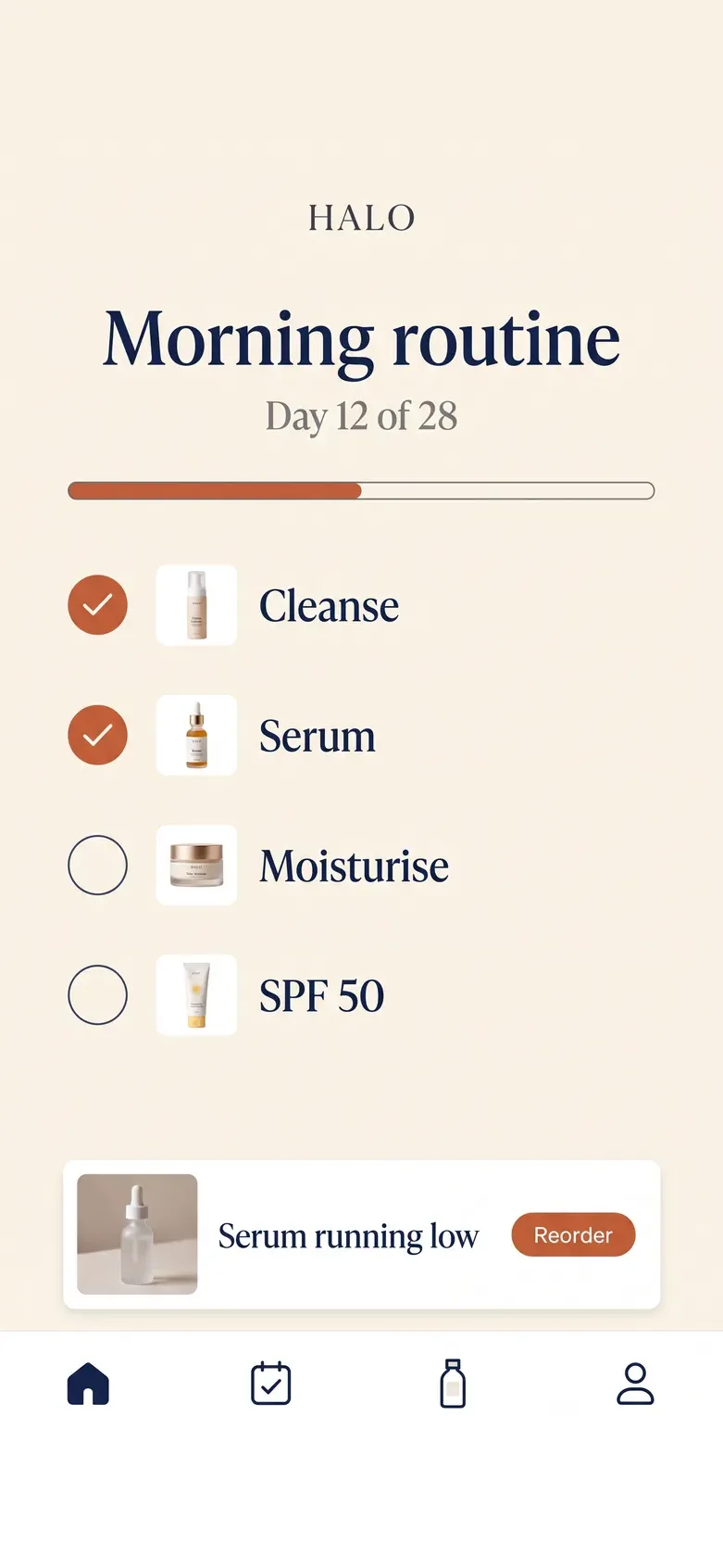
Routine tracker · iOS
A daily checklist that feels like a ritual
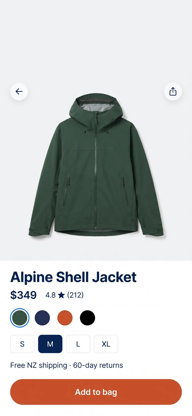
Retail · iOS · Android
Swatches, sizes and the add button where the thumb rests
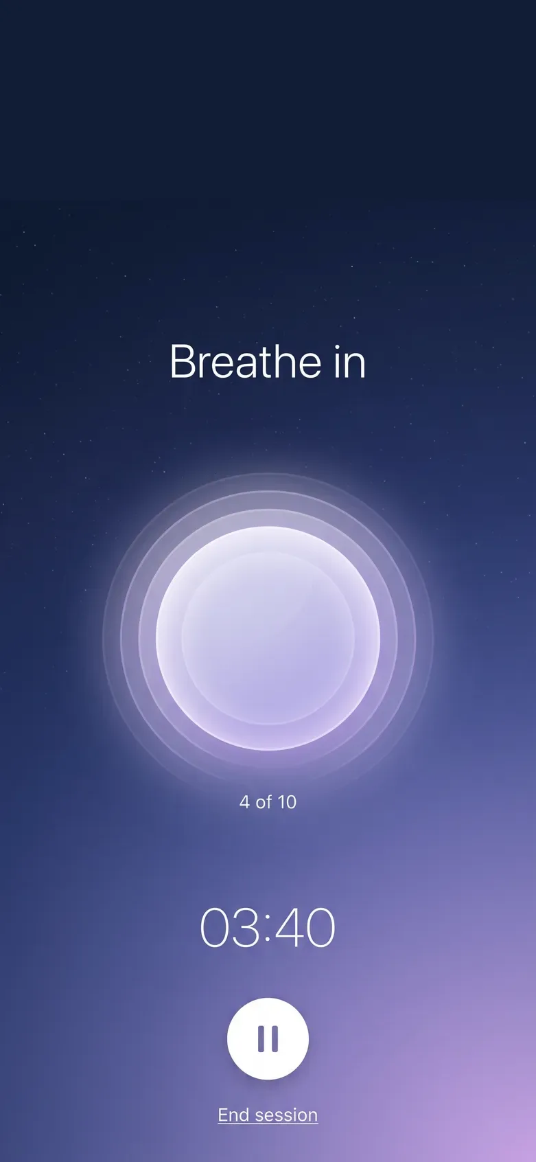
Sleep & focus · iOS
One calm screen, nothing to tap by accident
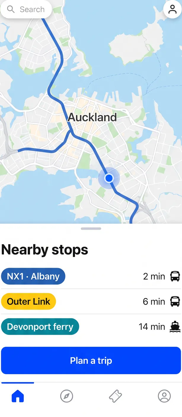
Transit · Android
A bottom sheet over the map, times you can read while walking
The same pay screen on both platforms. Flip between them: the brand, the layout and the main action stay put. The navigation, controls and type follow what each platform's users already know.
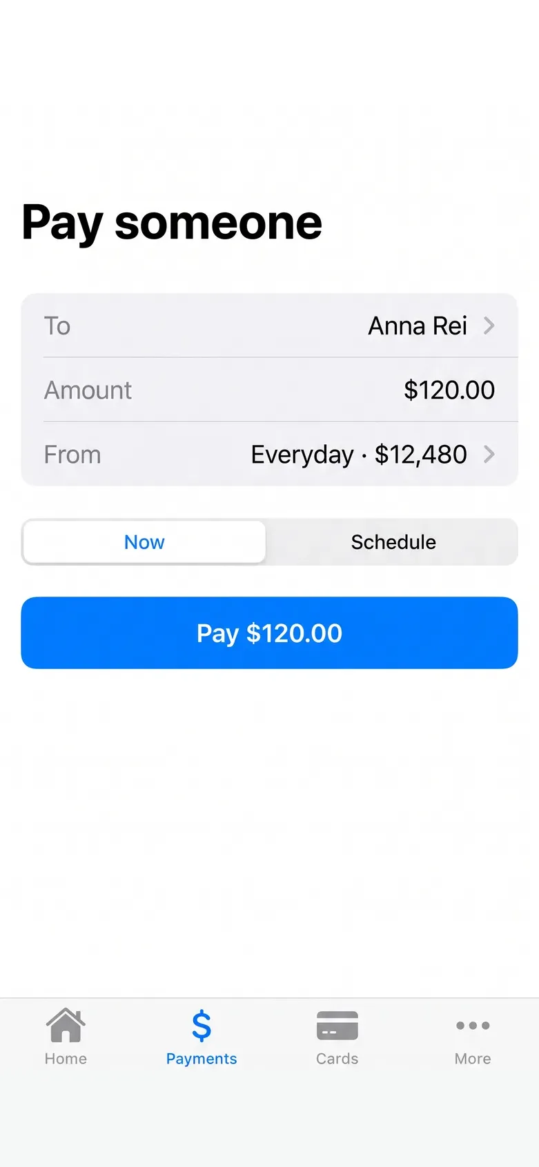
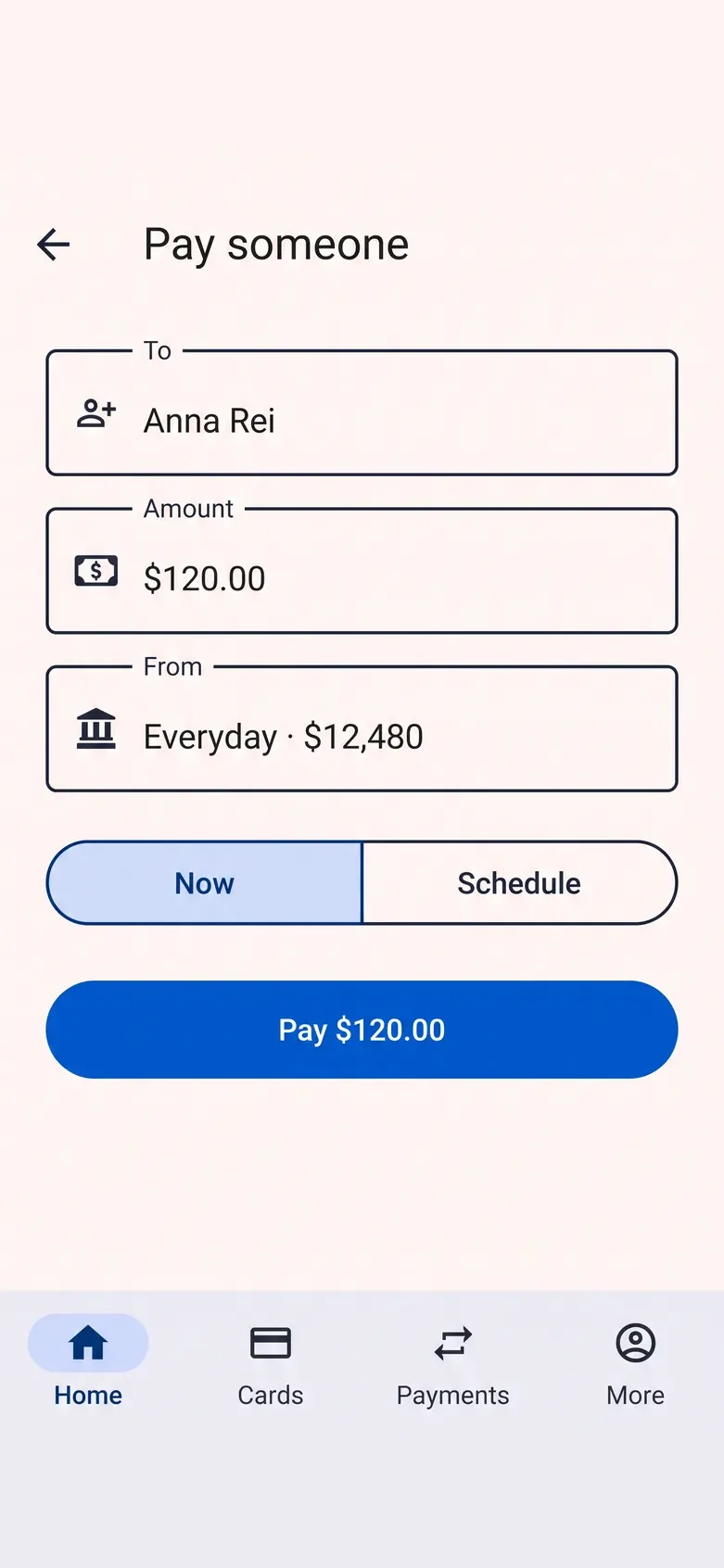
Kowhai Bank · Pay someone · iPhone 15
What never changes: the brand colours, the type scale, the order of information and the one main action in the thumb zone. One component library covers both platforms. There is no second design.
Most people hold the phone in one hand and reach with the thumb. So the important things go where the thumb lands, and the risky ones go where it doesn't.
We test every flow on a real phone, one-handed, on a moving bus. If the main action needs two hands, it moves.

Four stages, in order: flows, wireframes, a prototype, then the final design. Each one gives you something to tap or argue with.
 Flow review · week 1
Every screen, state and dead end drawn as a map before anything is designed. You see the whole app on one wall.
Grey-box wireframes of the real flows, tested by five real users on their own phones. Fixes are cheapest at this stage.
A clickable prototype that feels like the app, gestures and all. You tap through it before any code is written.
Final UI for iOS and Android, a component library with every state, and a handover your developers can build from.
“Service provided was very patient and knowledgeable responding to all our needs and queries in a timely, efficient manner.”
Prove the idea with a prototype, design the whole app, or keep a product designer on your team. You get a fixed scope and an itemised quote before anything starts.
NZD, ex GST · two weeks
The core flows mapped, wired and prototyped, so you can test the idea and pitch it before you build.
NZD, ex GST · per app
Full UI design for iOS and Android, a component library and a build-ready handoff.
NZD, ex GST · per month
A product designer on your team for the releases after launch.
One core design that follows each platform's conventions where users expect them: navigation, controls, type and gestures. It is clearly your app on both, and feels at home on each.
Yes. You get a clickable prototype of the real flows on your own phone, and we run usability rounds on it. A change at that stage takes hours. After the build it takes weeks.
Yes. They get full specs, assets, a component library and every state documented. Or we can build it ourselves: see Mobile App Development.
We design them when the product needs them, from the same system. Most apps start on the phone and add larger layouts once the flows have settled.
A prototype of the core flows takes two weeks. A full app design usually takes six to ten weeks, depending on the number of flows and usability rounds.
Yes. We start by auditing the current app on a real phone: where people drop off, what they tap by accident, what they never find. Then we redesign the flows that matter most.
Send the idea, the store link, or the flows on a napkin. We’ll come back with a flow map and an itemised quote within two working days.
Get a quick quoteTell us what you need. We’ll come back with ideas, a timeframe and a fixed quote.