Looking generic in a crowded market
When your brand looks like everyone else's, the only thing left to compare is price.

Where AXIS startedPatients couldn't tell the clinic apart from the hospital radiology department next door.
Your brand is the gut feeling people get before they’ve read a word. We build that feeling on purpose: a mark, palette, type and voice that people trust at first glance.
Businesses we work with
























People judge a business by how it looks, often before they've spoken to you. AXIS Radiology came to us caught in all three.
When your brand looks like everyone else's, the only thing left to compare is price.
Where AXIS startedPatients couldn't tell the clinic apart from the hospital radiology department next door.
Different colours on the website, a stretched logo on LinkedIn, a rogue font in the pitch deck. Every mismatch chips away at trust.
Where AXIS startedFive clinic locations carried different signage.
The brand you launched with got you this far, but it no longer fits the business. Investors, partners and new hires notice before you do.
Where AXIS startedAuckland X-Ray & Imaging Services had outgrown its name and its look.
“Loved the original work from Krush so much that I got them to do a second brand website for me as well. It's the extra attention to detail that they do. Highly recommend!”
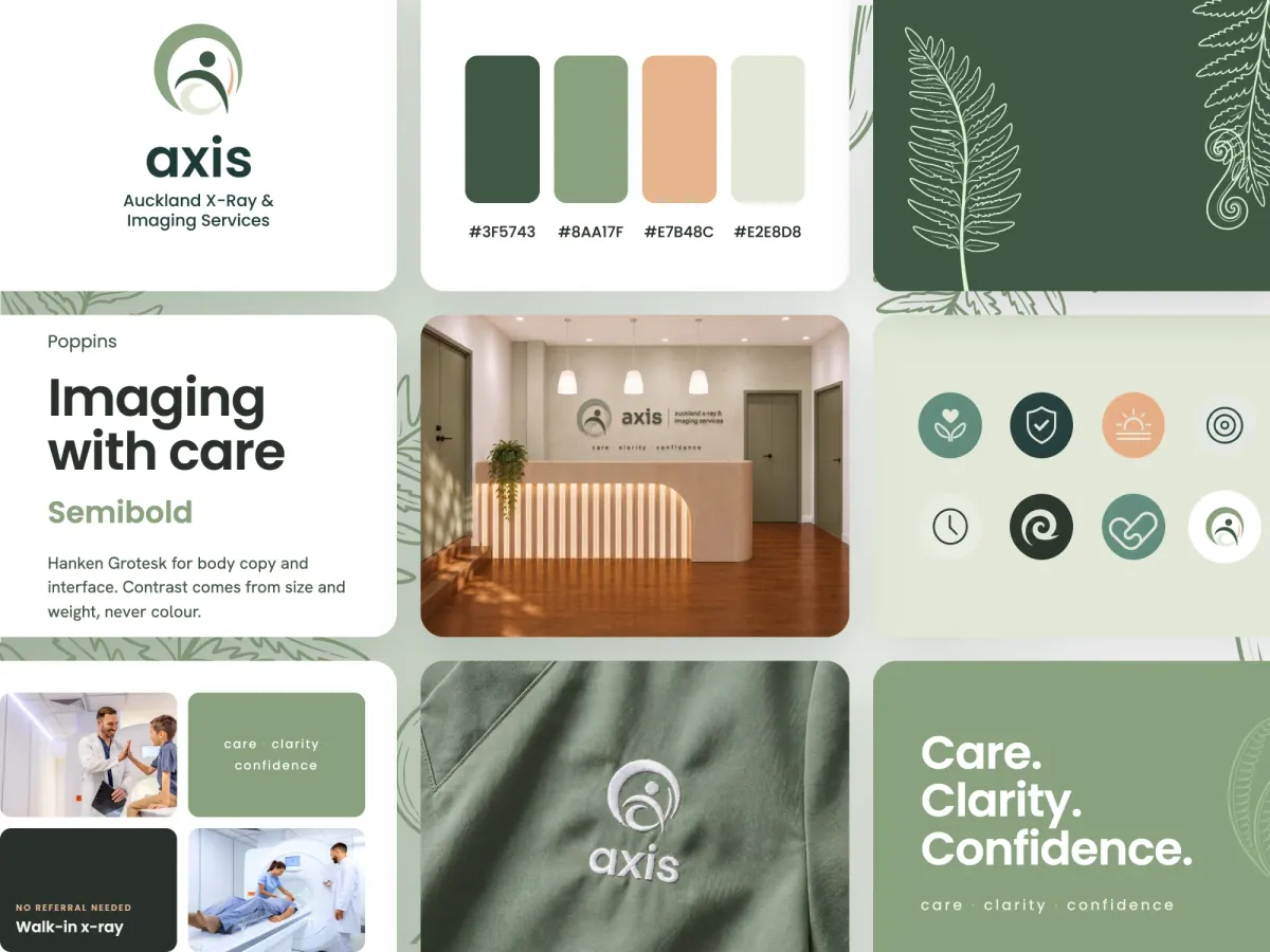
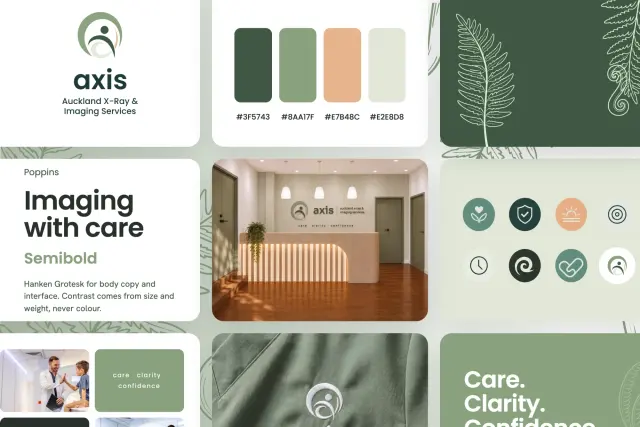
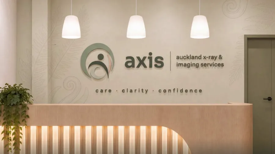
Auckland X-Ray & Imaging Services had outgrown its name and its look. As AXIS it has one calm identity: mark, palette, pattern library, brand book, website, video and photography.
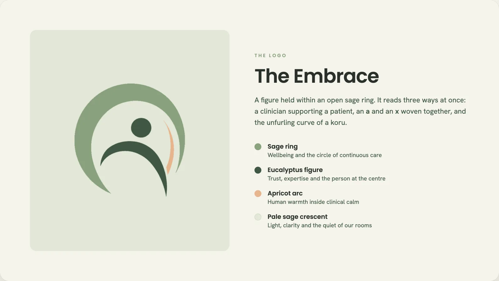
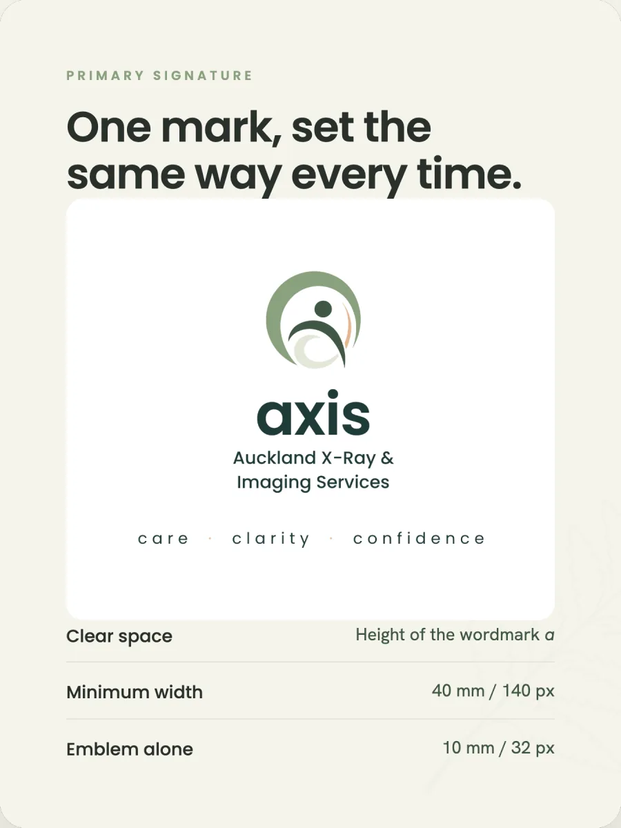
A figure held inside an open sage ring. It reads three ways at once: a clinician supporting a patient, the letters a and x woven together, and the unfurling curve of a koru.
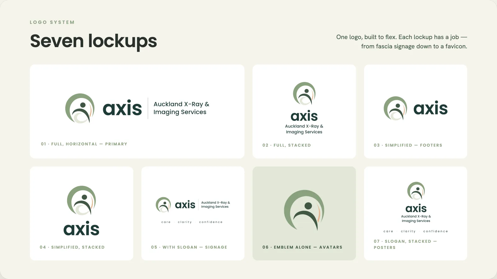
One logo, built to flex. Each lockup has a job, from fascia signage down to a favicon. The brand book sets the clear space and minimum sizes.
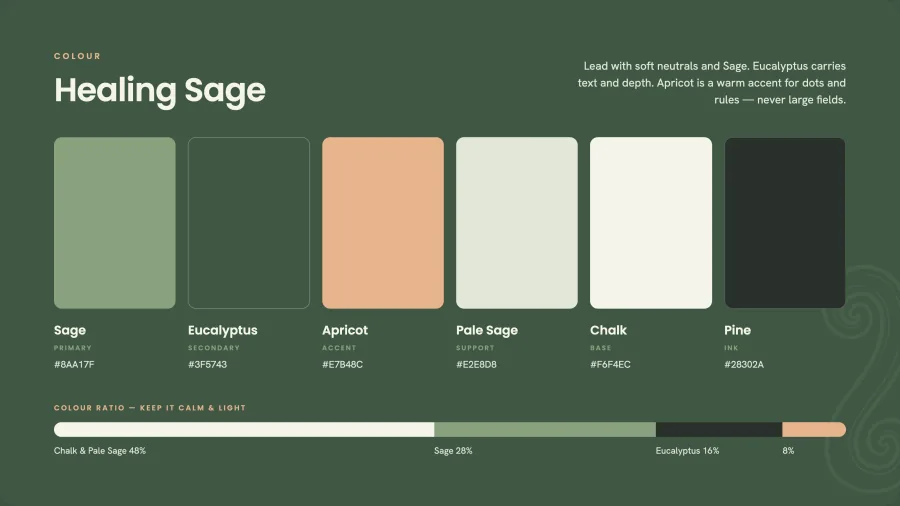
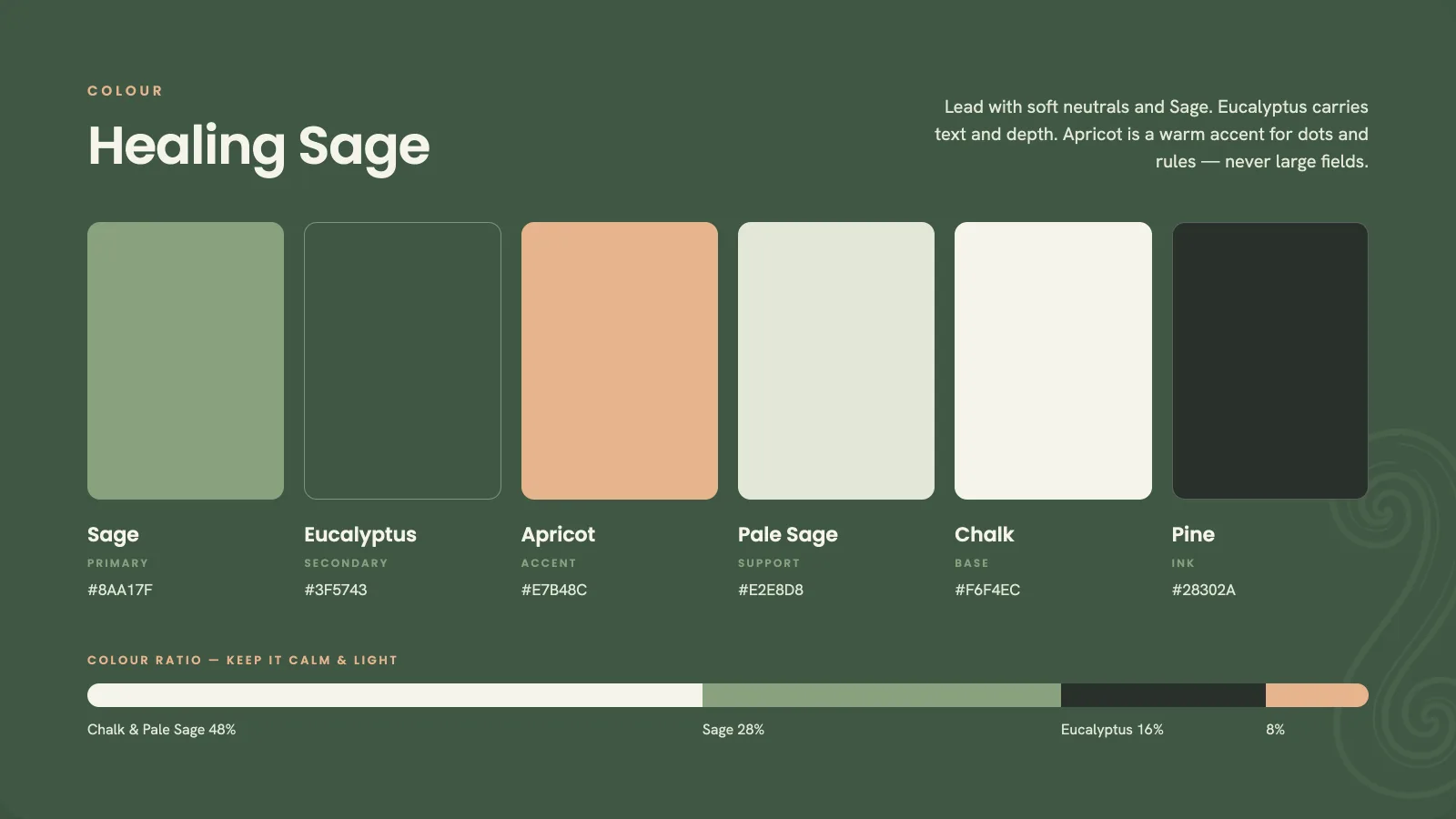
Soft neutrals and Sage lead. Eucalyptus carries text and depth. Apricot is a warm accent for dots and rules, never large fields.
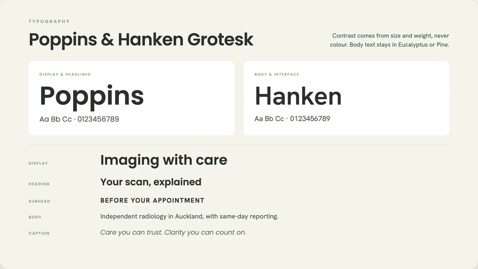
Poppins for headlines, Hanken Grotesk for body copy. Contrast comes from size and weight, never colour.
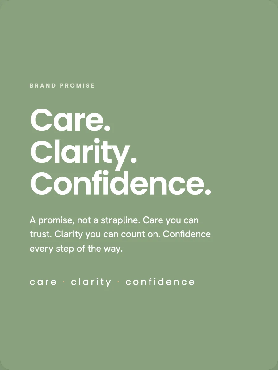
The positioning comes down to three words: care, clarity, confidence. Hand-drawn fern and koru line work roots the brand in Aotearoa, and seven icons carry the promises onto walls, brochures and screens.
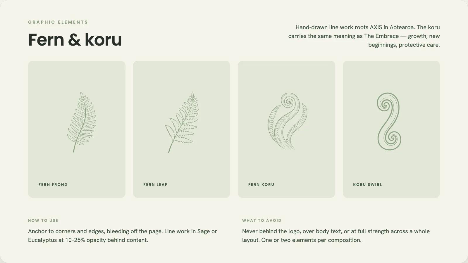
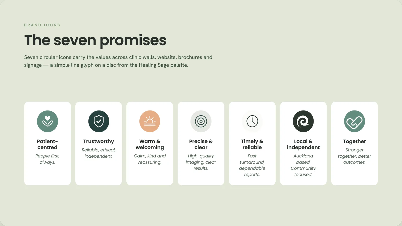
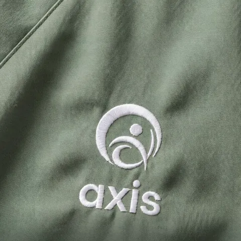
The same book runs the reception wall, the embroidered uniforms, the social tiles and the new website. We produced the video and photography too.
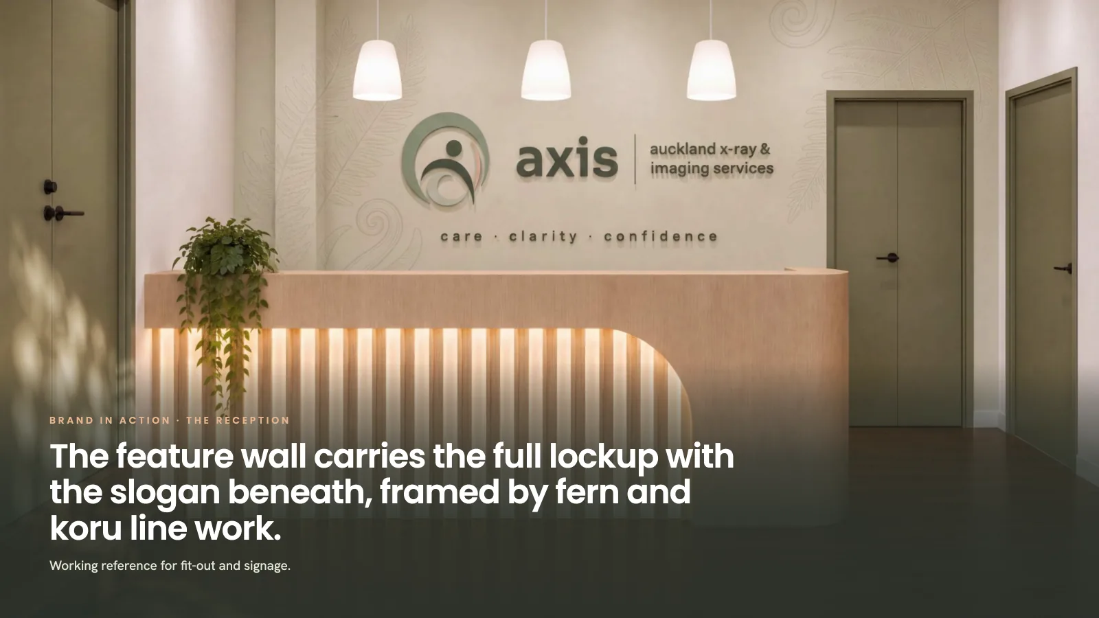
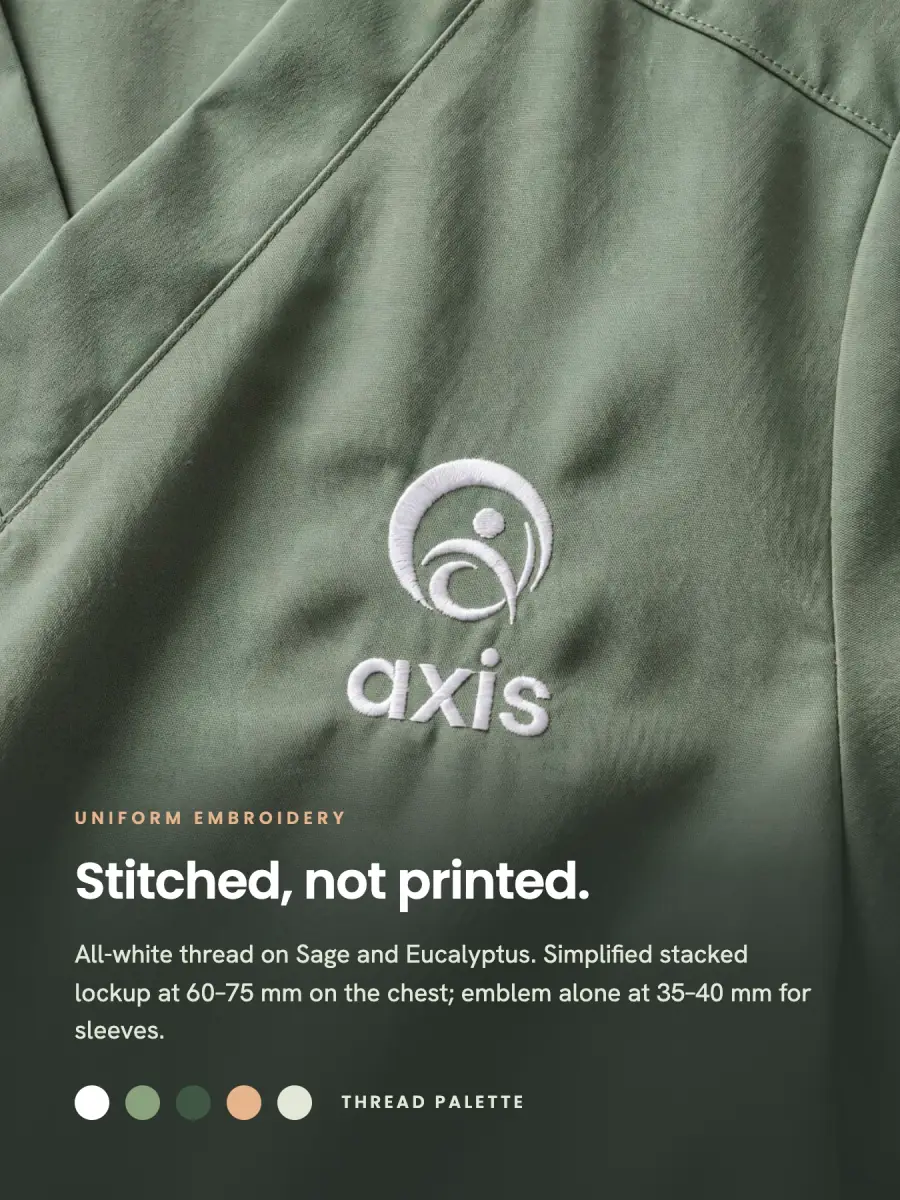
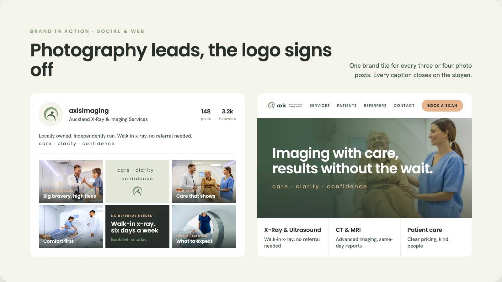
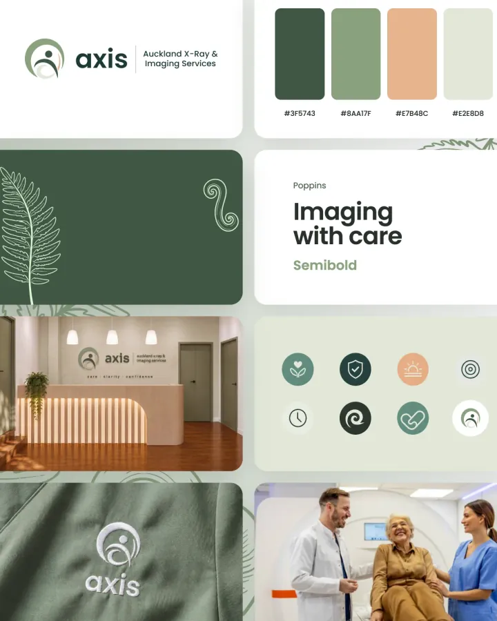
Mark, palette, pattern library, 19-page brand book, website, video and photography.
View the full case studyA brand review is free and takes 30 minutes.
Interviews, a competitor audit and a hard look at what you already have. We work out what to keep and what to drop.
One sentence that says who you're for and why you win. Everything visual is built to prove it.
Mark, palette, type and a visual system, presented as real applications rather than a logo floating on white.
Two structured rounds. We refine the chosen direction until you sign it off.
Brand book, every file format, templates for the channels you use, and a handover session so your team can run it.
The job changes with the industry. Pick yours to see what it has to get right.
Health brands need to feel approachable and professional at the same time. We find the balance and turn it into a system your team can run.
The people who pitch are the people who design. No handoff to juniors after you sign.
Every deliverable, review round and file format is itemised and agreed before anything starts.
We refine the design until it's right. Feedback is structured so nothing gets lost.
Every concept is shown on signage, screens and stationery, so you see how it works in real use.
Every file, every format, in your name. No licensing surprises, no ongoing fees to use your own brand.
We start with positioning and messaging, so the visual identity has a clear job to do.
Word for word from our Google listing.
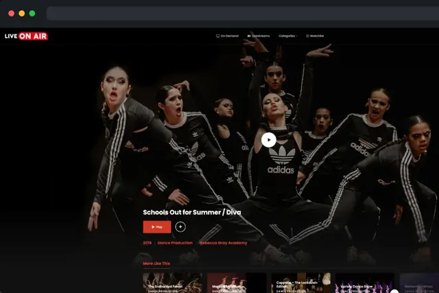
“Awesome graphics for a large stage production!”
“Krush digital have done an amazing job creating my website. There was something from the very first email received that made me think out of all the other designers that I needed to proceed with Krush and I'm very lucky I did!”
“I had KRUSH Digital do some product photography for me recently for my small business's website and I could not be happier with the result! Quality content and super professional not to mention such a quick turn around.”
Fixed scope, fixed quote, itemised before anything starts. Every tier comes with source files you own outright.
NZD, ex GST
For new ventures that need a credible identity fast.
NZD, ex GST
The full system most growing businesses need.
Scoped and quoted after a review
For established brands rolling out across many channels.
A logo is one asset. A brand is the whole system: mark, colour, type, voice and the rules that hold them together. We build the whole system. The logo is its most visible part.
Yes. Every identity comes with one: usage rules, spacing, colour values, type scales and the do-nots. It keeps your brand consistent when someone else picks up the files.
Yes. We keep what people already recognise and modernise everything around it.
Around four weeks from kick-off to a signed-off identity and brand book. Larger rollouts across packaging, signage or web run longer and are scoped up front.
You do. Every source file, in every format, in your name. No licensing surprises.
Get an estimate in a few taps. Then we’ll tell you what’s working, what’s holding you back, and what a sharper identity would take.
Get a quick quoteTell us what you need. We’ll come back with ideas, a timeframe and a fixed quote.