AI-assisted layouts and dynamic content
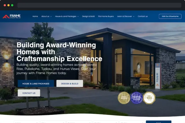
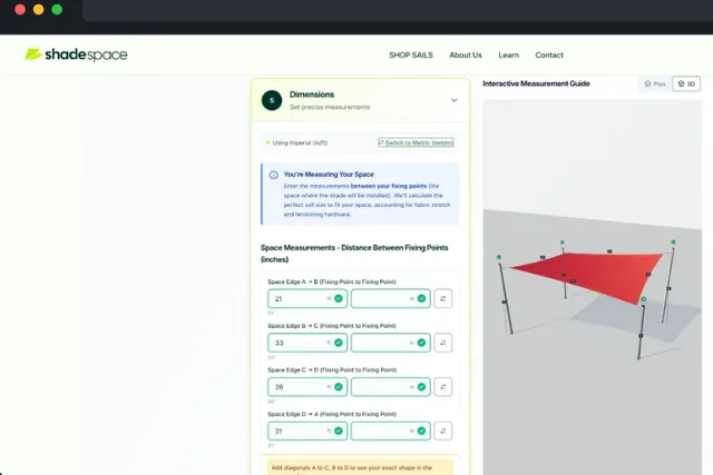
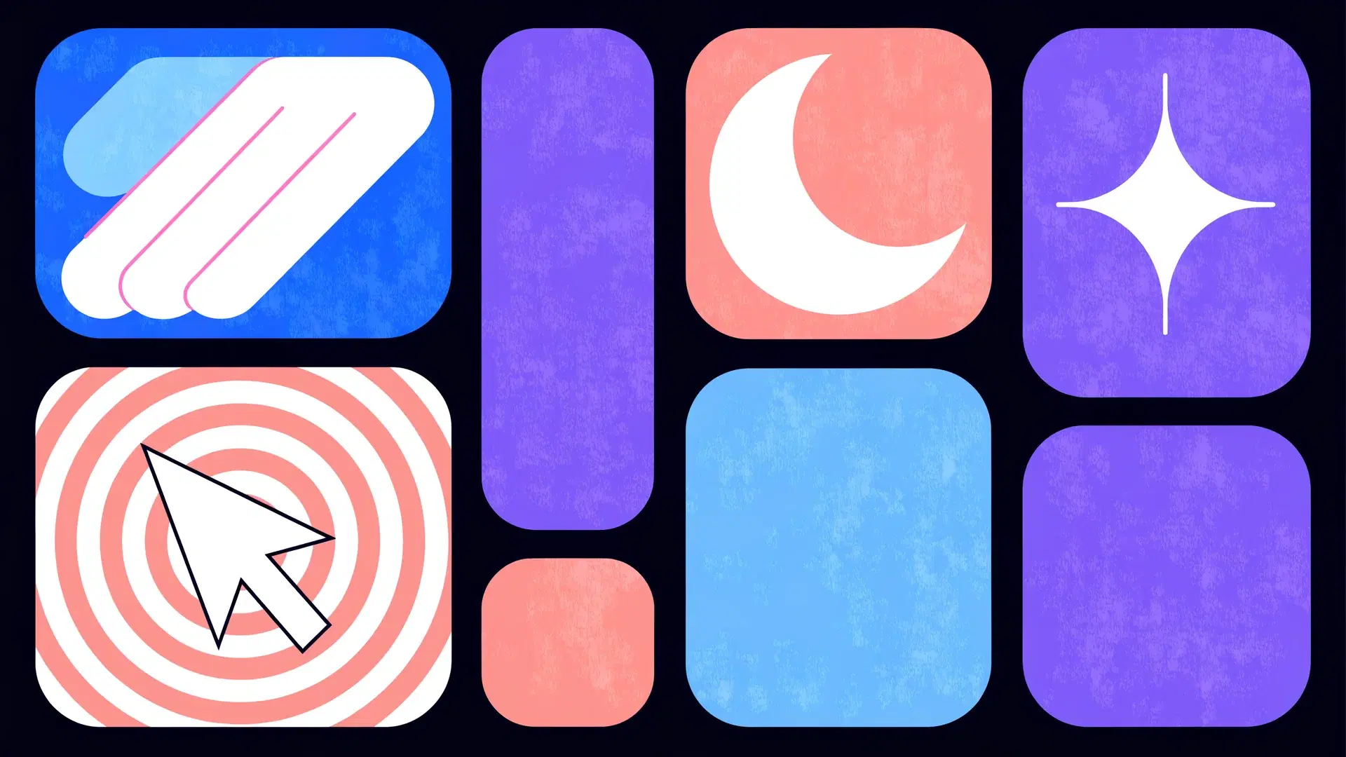
The most forward-thinking sites in 2026 have moved beyond static pages. They reorganise themselves based on user behaviour, time of day and traffic source. AI-assisted layout engines can now serve different hero sections to first-time visitors and returning customers, adjust content density to suit the device, and personalise CTAs without a developer touching code.
This doesn't mean handing your design to a robot. The best implementations use AI as an optimisation layer on top of a strong, deliberate design system. The creative direction stays human, and the small adjustments that improve conversion happen automatically. It works like A/B testing at a thousand variants per second.
Bento grids and structured visual hierarchy
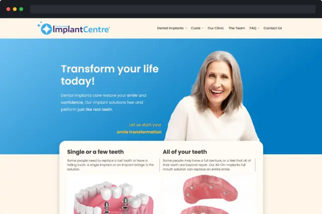
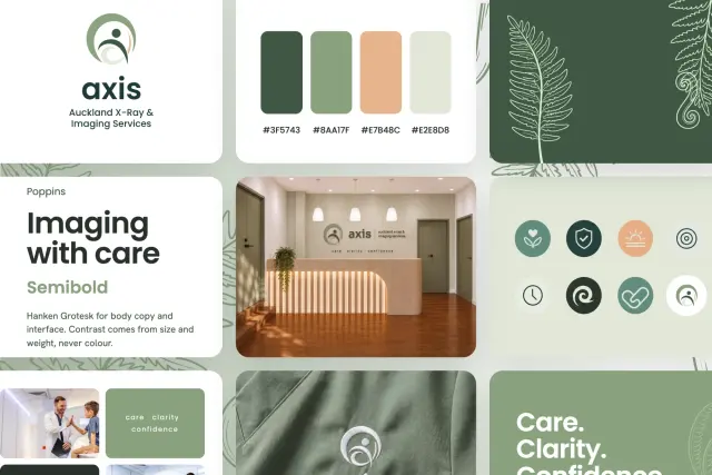
The bento grid, inspired by the compartmentalised Japanese lunch box, has gone from a novelty layout to a serious organisational tool in 2026. It works because it gives users clear visual containers for different types of information: features, stats, testimonials and CTAs, all scannable at a glance without competing for attention.
A good bento layout takes restraint. Each cell should hold one idea with one visual treatment. When designers overload cells with too much information or make every cell the same size, the whole pattern collapses into visual noise. Use size variation to signal importance, and leave breathing room between containers.
Kinetic typography and scroll-driven animation
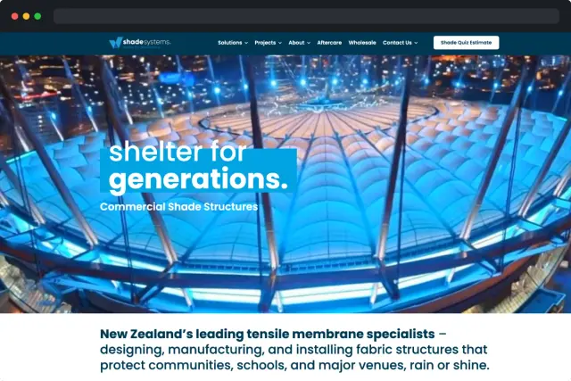
Static headlines are giving way to type that moves, transforms and responds to scroll position. Kinetic typography is text that animates on entry, reveals on scroll or reacts to cursor movement. It adds personality and directs attention without a single image. Done well, it makes a page feel alive. Overdone, it feels like a tech demo.
The scroll-driven animation API, now supported across all major browsers, has made these effects performant and accessible without heavy JavaScript libraries. The best implementations are subtle: a heading that fades up as you scroll into view, a stat counter that ticks as it enters the viewport or a word that highlights as you read past it. The animation should serve the story, not distract from it.
Dark mode as a design-first choice
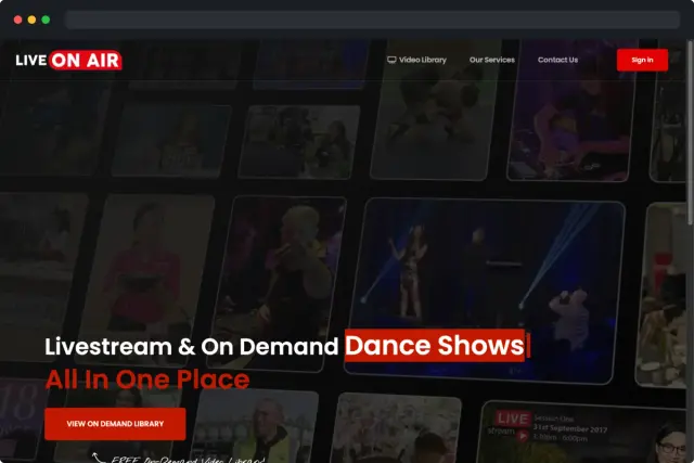
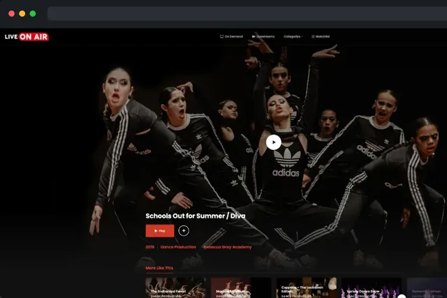
Dark mode has gone from a user preference toggle to a deliberate design statement. In 2026, brands are launching dark-first, using deep, rich backgrounds as the default to create contrast, draw attention to photography and position themselves as premium. It's particularly effective for creative agencies, tech brands and luxury e-commerce.
Designing for dark mode well requires more than inverting your colour palette. Contrast ratios need careful attention, shadows work differently against dark backgrounds, and typography often needs to be lighter in weight to maintain readability. Done poorly, dark mode feels gloomy. Done well, it feels intentional and sophisticated.